An Oldie but a Goodie
Old geologic maps have become somewhat of a fascination of mine. I stumbled upon some at work and have been collecting my favorite examples ever since. The color palettes and symbology speak to me, plus they stand up well as examples of good data visualization.
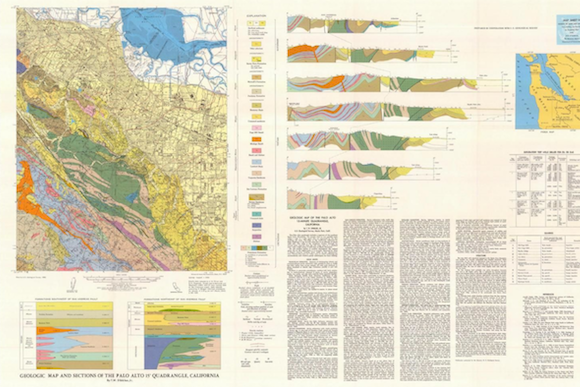
I decided on my favorite era of the medium after an afternoon of querying the USGS National Geologic Map Database. My research points to 1960-1975 as the aesthetic golden age of geologic map publication in America. Below I have included one of my favorites, a map of Palo Alto by Thomas Dibblee from 1966. Click on the map to view full size on the USGS site.

What I like most about this graphic is the diverse cast of symbology supporting the primary map. Each figure, table, legend, and glyph works together to describe a complex natural system. In Beautiful Evidence, Edward Tufte explains the value of including different modes of information in data visualizations.
Words, numbers, pictures, diagrams, graphics, charts, tables belong together. Excellent maps, which are the heart and soul of good practices in analytical graphics, routinely integrate words, numbers, line-art, grids, measurement scales. Rarely is a distinction among the different modes of evidence useful for making sound inferences. It is all information after all.
Geological maps like the one above are a great example of this principle. When maps are combined with supporting figures, tables, and text, the publications become more than a sum of their parts. They are transformed into a guidebook for a section of the earth over hundreds of thousands of years.
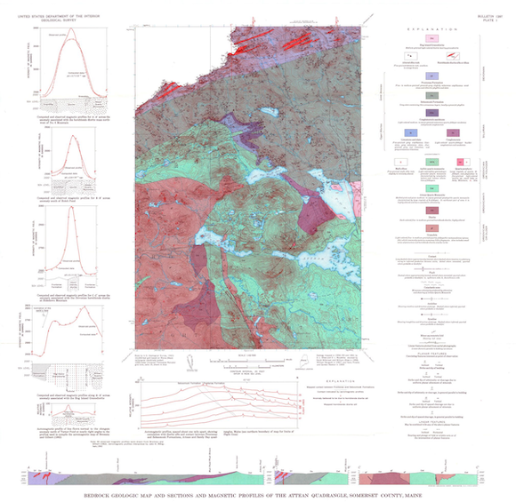
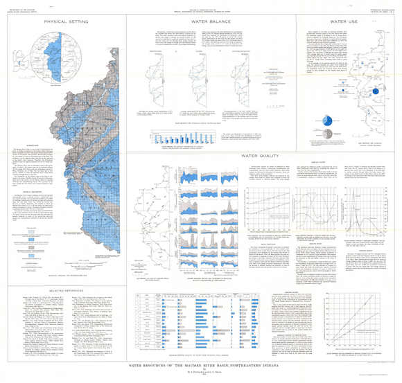
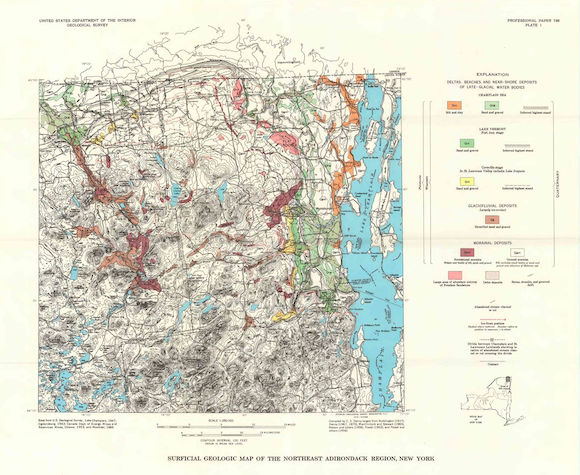
Below I have included a some more vintage earth science graphics from the USGS. Make sure to click through to the the high resolution versions.


