Revenge of Running Map

I have been tracking my runs for a few years now, and have always wanted to do something with the data. After a few iterations, this map is what I came up with. I have written below about my inspiration for the visualization, some technical details, and a bit of unnecessary evangelizing for the sport of running.
On running
I am an on-again, off-again runner. I haven’t been getting my kilometers in for the past few months, but this time last year I was starting to ramp my training up for the Calgary Marathon. Sports don’t come naturally to me, so completing a marathon is by far my biggest athletic achievement to date.
Convincing yourself to get out running can be difficult (my recent dry spell is a testament to that). But it’s worth it — for the exercise, because sneakers are cheaper than a gym membership, and to get to know a different side of your city.
Visualization
Another reason to pick up running is the sweet, sweet data. If you use an activity tracker, such as Strava or Runkeeper, then every time you go on a run new data in the form of a GPS trace file is generated. Most activity tracker apps allow you to painlessly export your data out of the service. You can then do your own analysis, or in this case, make maps.
A great example of visualizing activity data is the beautiful Strava global heatmap. I have used the global heatmap as a resource when traveling to new and unfamiliar cities to aid in the search for scenic and well-traveled running paths.

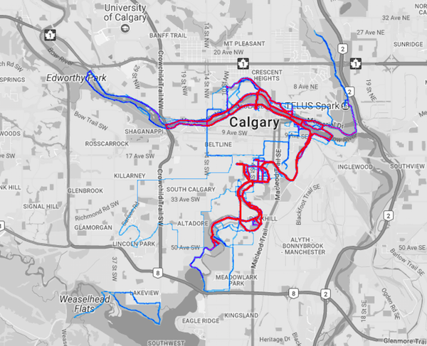
With a Strava premium subscription, you can generate your own personalized heatmap. This project started out as an attempt to recreate my personal heatmap and improve my D3 skills in the process.
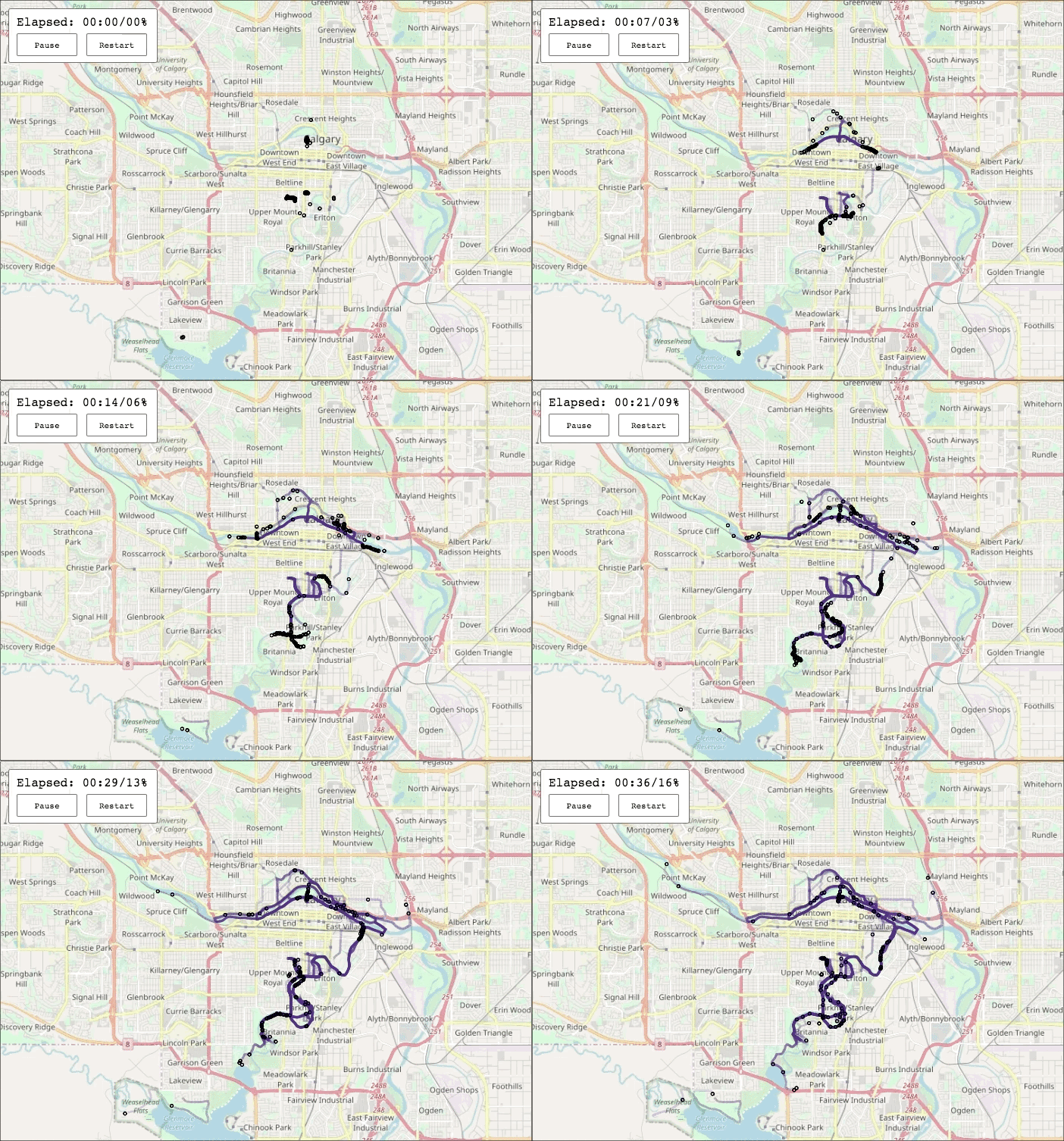
Time and speed are an important part of running which you don’t get to see in the personal heatmap. My goal with this visualization was to convey that motion. The inspiration for this came from the excellent America’s Cup Finale piece by Mike Bostock and Shan Carter for the New York Times.
After adding movement, all the points start superimposed and then venture out in different directions. This creates an effect similar to a swarm of insects or a Super Meat Boy victory sequence. The heatmap is built up over time as all of the points move along their routes.
Implementation
The map is displayed in the browser using D3.js. I have been tinkering with the library for a few years, and this is my first serious project. I relied heavily on a few examples to get going, especially this block and viewing source on the America’s Cup article mentioned earlier. Broadly, the steps involved in creating the visualization were:
- Exporting run data from Strava
- Writing a simple
.gpxparser in Python (you could also use gpx-py, but I wanted to write a simple parser as a learning exercise) - Resampling to a consistent time interval with pandas
- Visualizing the data in the browser using D3.js
If you want to try creating a similar map with your own data, I’ve put all the code and more detailed instructions on GitHub.
Performance
My biggest source of pain on this project has been performance and frame rate. The position of each point has to be updated many times per second for the animation to appear pleasantly smooth.
The usual D3 workflow consists of binding data to the DOM and rendering SVG elements. This DOM integration is a reason why D3 is powerful, but also imposes some limitations. Large amounts of nodes result in sluggish animations or browser crashes.
I tried to get to a level of performance that I was happy with using SVG rendering but was unsuccessful. Thankfully, I eventually stumbled upon a very helpful article by Irene Ros on working with D3 and Canvas. Using canvas as a renderer is more appropriate for my use case (many frequently updated nodes) and helped solve my performance woes.
To conclude
- See the full interactive version of the visualization here.
- Running is great and you should try it. While you are struggling through that Sunday morning long run, just think about all the data you are generating.
- SVG rendering doesn’t work well with many nodes, especially when elements are being frequently updated. Consider switching to canvas when performance becomes an issue.