Roadtrip
In August of 2016 I took advantage of unemployment to roadtrip across the United States. My friend was moving from New York City to Vancouver and had some precious cargo that he didn’t want to ship by air, so we decided to make a trip of it. Along the we spent a lot of time in national parks and I got badly sunburned on a couple occasions.
While we were travelling I had Google location history enabled on my Android phone and thought it would be a fun project to use this data to map out our path across the United States. In this post I’ll walk through how to map Google location data using R and ggplot2. All the code below can be found on GitHub.

Source Data
My first step was procuring data using the Google Takeout tool. I’ve had location tracking enabled since 2011 which amounts to a ~300 MB uncompressed JSON file. Here’s a sample of how the JSON is structured:
{
    "locations": [{
        "timestampMs": "1472048632150",
        "latitudeE7": 510354955,
        "longitudeE7": -1140796058,
        "accuracy": 22,
        "activitys": [{
            "timestampMs": "1472048632075",
            "activities": [{
                "type": "still",
                "confidence": 100
            }]
        }]
    }, {
        "timestampMs": "1472048258184",
        "latitudeE7": 510354955,
        "longitudeE7": -1140796058,
        "accuracy": 22
    }]
}
The JSON has the following key-value pairs:
| Name | Units |
|---|---|
| timestampMS | milliseconds (POSIX time) |
| longitudeE7 | decimal degrees x 107 |
| longitudeE7 | decimal degrees x 107 |
| accuracy | meters |
| activities | type (activity), confidence (%) |
All we technically need to make a map is a set of longitude and latitude points. But in order to filter down to a certain date range—such as a roadtrip—the timestamp column is also necessary.
Note: I’m not going to touch the other two data keys in this
analysis, accuracy and activities. Knowing the accuracy of each
data point and estimating type of motion (pedestrian, cycling,
vehicle) is incredibly important if you are trying to determine
traffic conditions in realtime or training a self-driving car, but not
a big deal my nation-scale roadtrip map.
Cleanup
Now that we’ve secured our location history file, it’s time to to start writing some R code. The end goal is to use ggplot2 to map our path, so as an intermediate step we need to convert from JSON to an R data frame.
There are a couple different ways to read JSON data with R (there are a couple ways to do everything with R). I landed on the RJSONIO package.
library(RJSONIO)
loc_file <- "data/loc_history.json"
loc <- fromJSON(loc_file)

> str(loc)
> List of 1
>  $ locations:List of 1029285
> ..$ :List of 5
> .. ..$ timestampMs: chr "1472048798254"
> .. ..$ latitudeE7 : num 5.1e+08
> .. ..$ longitudeE7: num -1.14e+09
> .. ..$ accuracy   : num 22
> .. ..$ activitys  :List of 2
> .. .. ..$ :List of 2
> .. .. .. ..$ timestampMs: chr "1472048797114"
> .. .. .. ..$ activities :List of 6
RJSONIO doesn’t output a data frame, it produces a list of lists that
matches how the actual JSON is structured. We can flatten our list of
lists to a data frame using a couple of the R languages more magical
array manipulation functions lapply and do.call.
## Drop everything except timestamp, lat, long
dropped <- lapply(loc[[1]], function(a) a[1:3])

## Convert list of strings to data.frame
loc_df <- do.call(rbind.data.frame, dropped)

> str(loc_df)
> 'data.frame': 1029285 obs. of  3 variables:
>  $ timestampMs: chr  "1472048798254" "1472048632150" ...
>  $ latitudeE7 : num  5.1e+08 5.1e+08 5.1e+08 5.1e+08 5.1e+08 ...
>  $ longitudeE7: num  -1.14e+09 -1.14e+09 -1.14e+09 -1.14e+09
This output is close to where we want it to be. Our final problem is that our time and coordinates are not in the units we want for our final map. The code below converts our date and coordinates columns into more standard units.
library(magrittr)

## Unix epoch time to date
loc_df$date <-
    loc_df$timestampMs %>%
    as.numeric %>%
    {./1000} %>% ## miliseconds to seconds
    as.POSIXct(origin="1970-01-01") %>%
    as.Date

## Decimal degrees * 10E7 to decimal degrees
loc_df$long <- loc_df$longitudeE7 / 10^7
loc_df$lat  <- loc_df$latitudeE7 / 10^7

> str(loc_df)
> 'data.frame': 1029285 obs. of  6 variables:
>  $ timestampMs: chr  "1472048798254" "1472048632150" ...
>  $ latitudeE7 : num  5.1e+08 5.1e+08 5.1e+08 5.1e+08 5.1e+08 ...
>  $ longitudeE7: num  -1.14e+09 -1.14e+09 -1.14e+09 -1.14e+09 ...
>  $ date       : Date, format: "2016-08-24" "2016-08-24" ...
>  $ long       : num  -114 -114 -114 -114 -114 ...
>  $ lat        : num  51 51 51 51 51 ...
Note: If you aren’t familiar with the %>% operator in R, it
is the forward pipe operator implemented in
the magrittr package. Pipes are used to chain functions
together just like in Unix..
The next step is filtering down the data to only contain the roadtrip. The Google location data I downloaded earlier includes every day since I activated my very first Android phone, which is a map for a different post. I also noticed some dramatic outliers which only would be possible if I teleported, so those had to be dropped as well using a latitude and longitude criteria.
## Filter only days in trip
trip <- ldf[ldf$date > as.Date("2016-07-28") &
            ldf$date < as.Date("2016-08-11"),]

## Remove outliers
trip <- trip[trip$long < -50,]
trip <- trip[trip$lat > 33,]
Optimization (or lack there of)
R doesn’t have a reputation as a particularly speedy language. The
above code took about 12 minutes to process a ~300 MB JSON file on my
2013 MacBook Air. There is room for improvement here, likely in the
JSON load and the do.call line. I only needed to run this code once
so speed wasn’t a priority.
Note: when I was just starting out writing R code I was fortunate to read The R Inferno by Patrick Burns. It is a well written reference on the subtleties of the R language told with a nod to Dante’s Inferno. Give it a look if you want to learn more about why R has such a complicated reputation.
First Look
Now that we have our coordinates in a more workable format we can start having a look. This is what my trip looks like using the stock R plotting function.
> plot(trip$long, trip$lat, type="l")
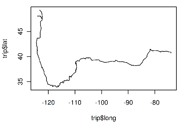
This isn’t a bad start. The path looks generally correct and I can pick out cities (clustered points on the path) vs. long stretches of driving. This type of initial exploratory plotting is useful for diagnosing data quality issues and confirming we are on the right track.
Plotting
There are a few more things we need to do in order to transform our data into something that can be called a map:
- Use an appropriate map projection for our data
- Add geographical borders (in this case US state boundaries)
- Note the points of interest
These are all things that can be accomplished using the mapping functionality including in the ggplot2 package. There are a number of mapping packages avaliable with R, but I like ggplot2. Not all plotting packages have a philosophy after all:
ggplot2 is a plotting system for R, based on the grammar of graphics, which tries to take the good parts of base and lattice graphics and none of the bad parts. It takes care of many of the fiddly details that make plotting a hassle (like drawing legends) as well as providing a powerful model of graphics that makes it easy to produce complex multi-layered graphics.
Note: I’ve used ggplot quite a lot in the last three or four years at work and for my own projects and can’t speak highly enough about it. Once I got the hang of creating charts and maps programmatically it made producing graphics using Excel seem painful.
library(maps)
library(ggplot2)
library(ggrepel)
states <- map_data("state")
cities <- read.csv(cities_file)
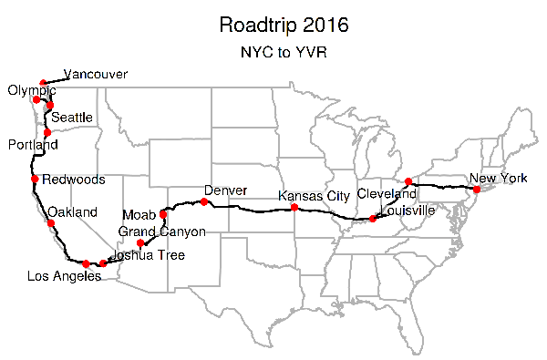
trip_map <- ggplot()+
ggtitle("Roadtrip 2016", subtitle="NYC to YVR")+
geom_map(data=states, map=states,
aes(x=long, y=lat, map_id=region),
fill="#ffffff", color="grey70", size=0.4)+
geom_path(data=trip, aes(x=long, y=lat), linetype=1)+
geom_point(data=cities, color="red",
aes(x=long, y=lat, group=NULL))+
geom_label_repel(data=cities, aes(x=long, y=lat, label=city),
label.size=0, size=3,
fill=rgb(1,1,1,0.6),
label.padding=unit(0, "lines"),
box.padding=unit(0.15, "lines"),
point.padding=unit(0.15, "lines"))+
coord_map()+
theme_void()+
theme(plot.title = element_text(hjust = 0.5),
plot.subtitle = element_text(hjust = 0.5))
I’m not going to go in to too much depth about the specifics of this code, a lot of it is just aesthetic configuration options. But generally speaking:
ggtitle: adds a title to the figuregeom_map: draws US state polygons. Themapslibrary contains boundary data for all of the continental US statesgeom_path: draws our route, data comes from thetrip data.framegeom_point: draws a red circle on the location of every place we stopped for a significant amount of time. I created the cities.csv file manually by pulling coordinates from google maps.geom_label_repel: uses the ggrepel library to draw text labels for each of the stops. ggrepel uses an algorithm to place labels without overlapping each other (unfortunately the route is overlapped in some instances).coord_map: causes our data to be projected using the mercator projection. For more details check out the documentation for the coord_map function.theme_void: strips all of the theme elements from the resulting plottheme: adds back in the title and subtitle
Final product
Below you can see how the final map turned out. I’m quite pleased with the result!
Some final thoughts:
- Parsing out and displaying the amount of distance traveled per day could be interesting. Or determining average driving speed across the trip and then breaking that down by state or time of day.
- The R graphic can be output in SVG, which apart from being nice to display on the web would be easy to losslessly put on t-shirt or mug to commemorate the trip.
- Placing labels computationally is quite difficult,
ggrepeldoes an okay job but for a one off map like this you are probably better off just placing them yourself.
